Editing Landing Pages
The Landing Page Editor
Guide: How to create a landing page from scratch
Landing pages are visually rich and flexible, offering more layout and design options than chaptered pages. They can utilize almost all available components, allowing for greater customization. If you're unsure which components are available, please refer to our Components Library for a full list.
Visit Components Library
Unlike chaptered pages, which are structured with sidebar navigation, landing pages are full-width and use a more modular layout, allowing for a more engaging and immersive user experience.
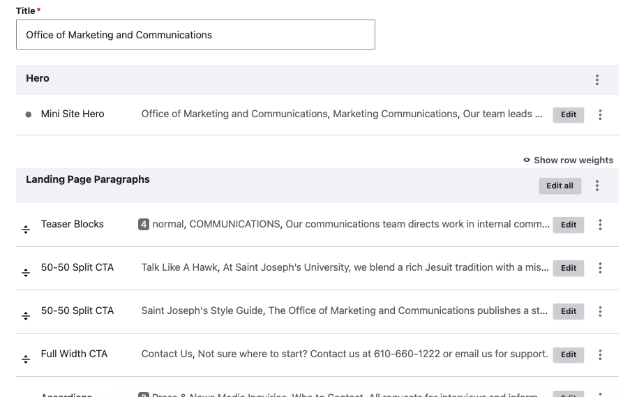
The outer shell of the landing page editor is exactly like what we’ve seen in our Page Editor Overview section. On landing pages, the page editor consists of two main sections: the "Hero" section and the "Landing Page Paragraphs" section. On landing pages, the hero is the component that makes up your page header. The landing page paragraphs will be the main guts of the page.
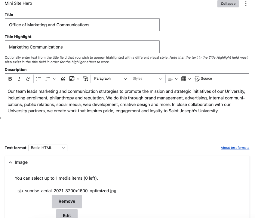
1. Hero Section
The Hero section controls the topmost visual element of the page, typically featuring:
- Title: The main heading of the page.
- Title Highlight: A portion of the title you want to appear in a different color or style for emphasis.
- Text Area: A short description or introductory message.
- Image: A background or featured image for visual impact.
Most sites for academic or administrative departments use the Mini Site Hero component, but other hero styles may be available depending on the site.
Guide: How to add a Minisite Hero
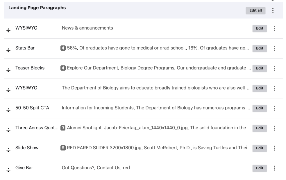
2. Landing Page Paragraphs Section
This section contains the main content of your page, structured with stackable components, which make up the contents of your page below the hero component. They appear in the editor in the same order as on the page.
Identifying Which Component to Edit
Locating the position (top, middle, bottom) and order of components while looking at your page in another window or tab will help you find the component you need to edit as you browse the "Landing Page Paragraphs" section. Common types include:
- Text-Only Sections → Are typically WYSIWYG (What You See Is What You Get) components.
- Image Galleries or Sliders → Look for components labeled "Slider" or "Gallery."
- Call-to-Action Buttons (CTAs) → Found in CTA components or added within a WYSIWYG section.
- Combinations of Text and Images → Components combining the attention-grabbing properties of images with the information quality of text.
If you're unsure which component is responsible for a certain part of the page, try looking for descriptive labels in the far left of the editor or view the latest version of the page before making edits.
A thorough breakdown of components, their inputs, image requirements, and optional configurations can be found in our Components Library.
Editing Components
To Edit a Component
- Locate the component you want to modify.
- Click the gray "Edit" button on the right-hand side of the component's toolbar.
- Make your desired changes in the editor.
- Preview your changes to ensure they appear correctly.
- Save the page as a draft before publishing (see Revision Log best practices).
Our Components Library describes the input fields for each component.
Our Images section describes how to work with images in components.
As always, if you have a question about using a specific component or are having trouble, just send us a ticket; we’re happy to help.
Adding, Reordering, and Removing Components
You may need to add or remove components.
Adding Components
- In the Drupal admin interface, go to “Content” and locate the page you want to edit.
- Click “Edit” to open the page in the content editor.
- Scroll to the section where you want to insert a new component.
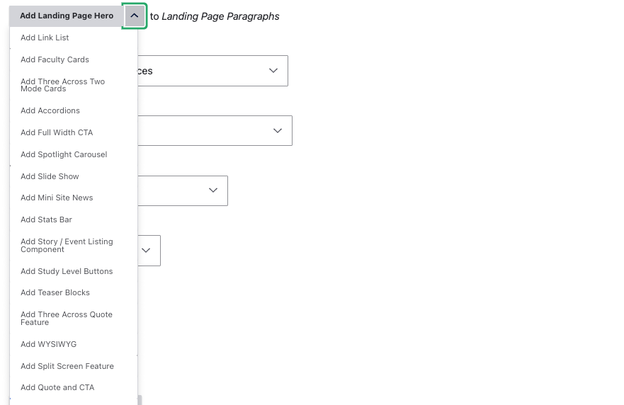
- Click the arrow on the "Add Landing Page Hero" button at the end of your list of existing components.
- You will see a scrollable dropdown of components you can use for this page type.
- Select a component from the menu.
- Configure the component by completing the required inputs.
If you are unsure what a given component looks like or its functionality, please refer to our Components Library.
Guide: How to add a component to a landing page
Configuring the Component
Most components will use the WYSIWYG editor. Others simply use text inputs. Those that use images will ask you to select an image using a pop-up menu.
When configuring a component for the first time, its input fields will be blank. These must be filled in for your component to display properly.
- Enter the required content, such as text, images, or links.
- Use formatting options to adjust styling where applicable.
- To use images in a component, follow the required size and resolution guidelines found in our section on Image sizing.
- Please follow our design and accessibility guidelines.
Toggle the "Change to:" dropdown to “Draft” and then click “Save” in order to preview your changes before making them live. If you are missing certain sections you expected to see, a required field might be blank. Return to the editor and double-check the component, looking for any fields you may have missed.
Guide: How to add and configure a Stats Bar
Guide: How to add and configure Teaser Blocks
Guide: How to add and configure a 50-50 Split CTA
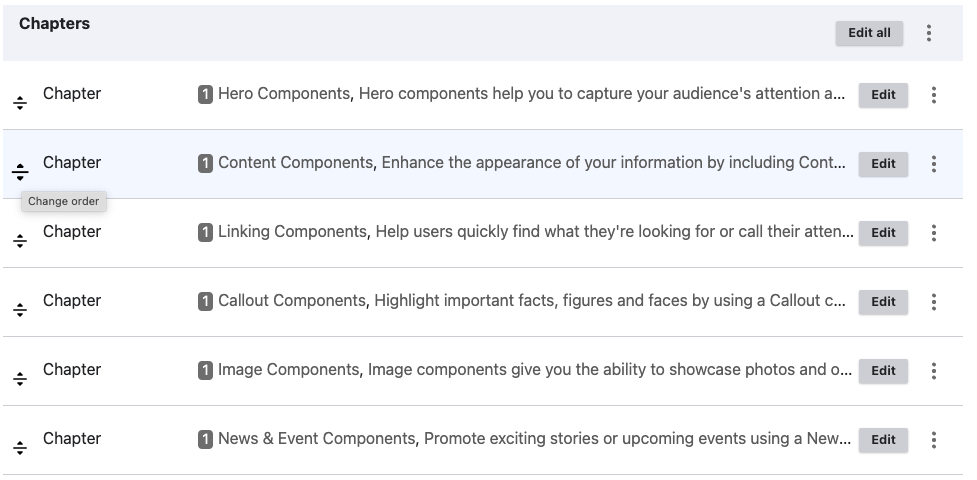
Reordering Components
To change the order of components, simply grab the handle to the far left of the component you wish to move and drag it to its new spot in the order.
If you accidentally click on "Show row weights," just click it again to get rid of it.
Removing Components
You may also remove components that you no longer want on the page. However, please be certain that this is what you want, since once a component is removed from the page, there is no way to get it back other than reverting to a prior version of the page.
Open the page editor and scroll to the component you wish to remove. Press the three vertical dots next to the edit button for that component. You will see two choices: “Remove” and “Duplicate.” To remove the component, select “Remove.”
💡 Note: Some components may require you to confirm you wish to delete them.
Save Changes as a Draft
To verify that the component has been removed successfully, toggle the “Change to:” dropdown to “Draft” and hit “Save.” You should see a preview of the page with the component removed.
< Return to Editing Pages - Basics Learn How to Edit Chaptered Pages >