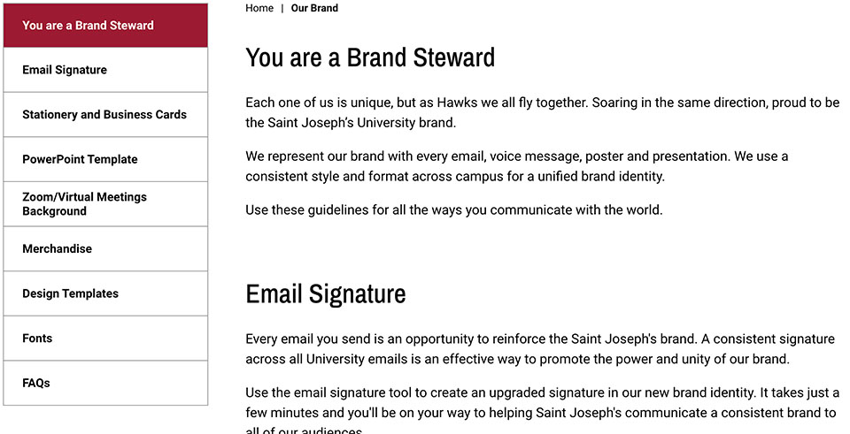
Components Library
Hero Components
Hero components help you to capture your audience's attention and allow you to communicate your message visually by placing a large splashy image at the top of your webpage. The Hero image is accompanied by supporting titles and text depending on which version of the component you choose.
Landing Page Hero
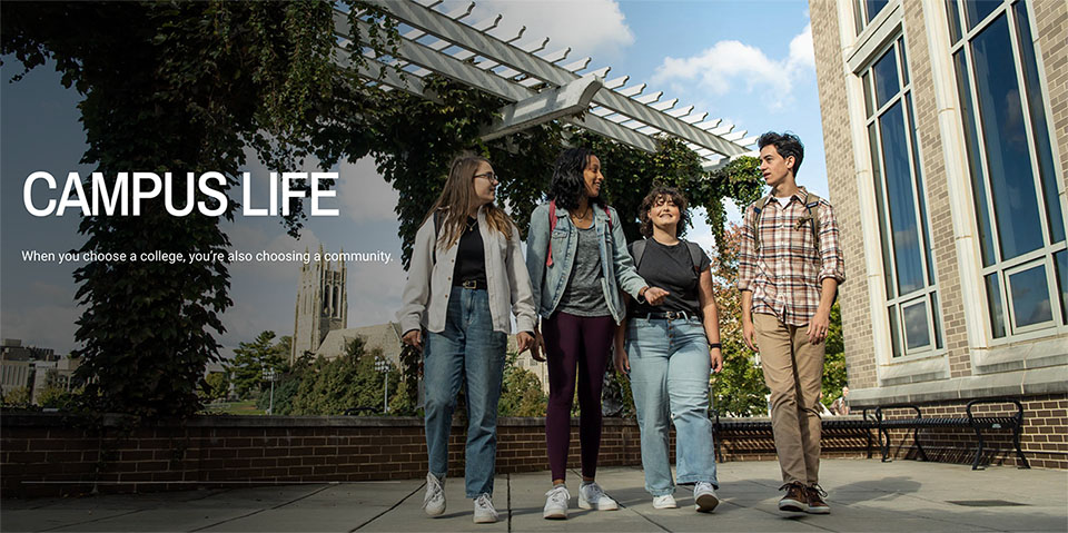 https://www.sju.edu/campus-life
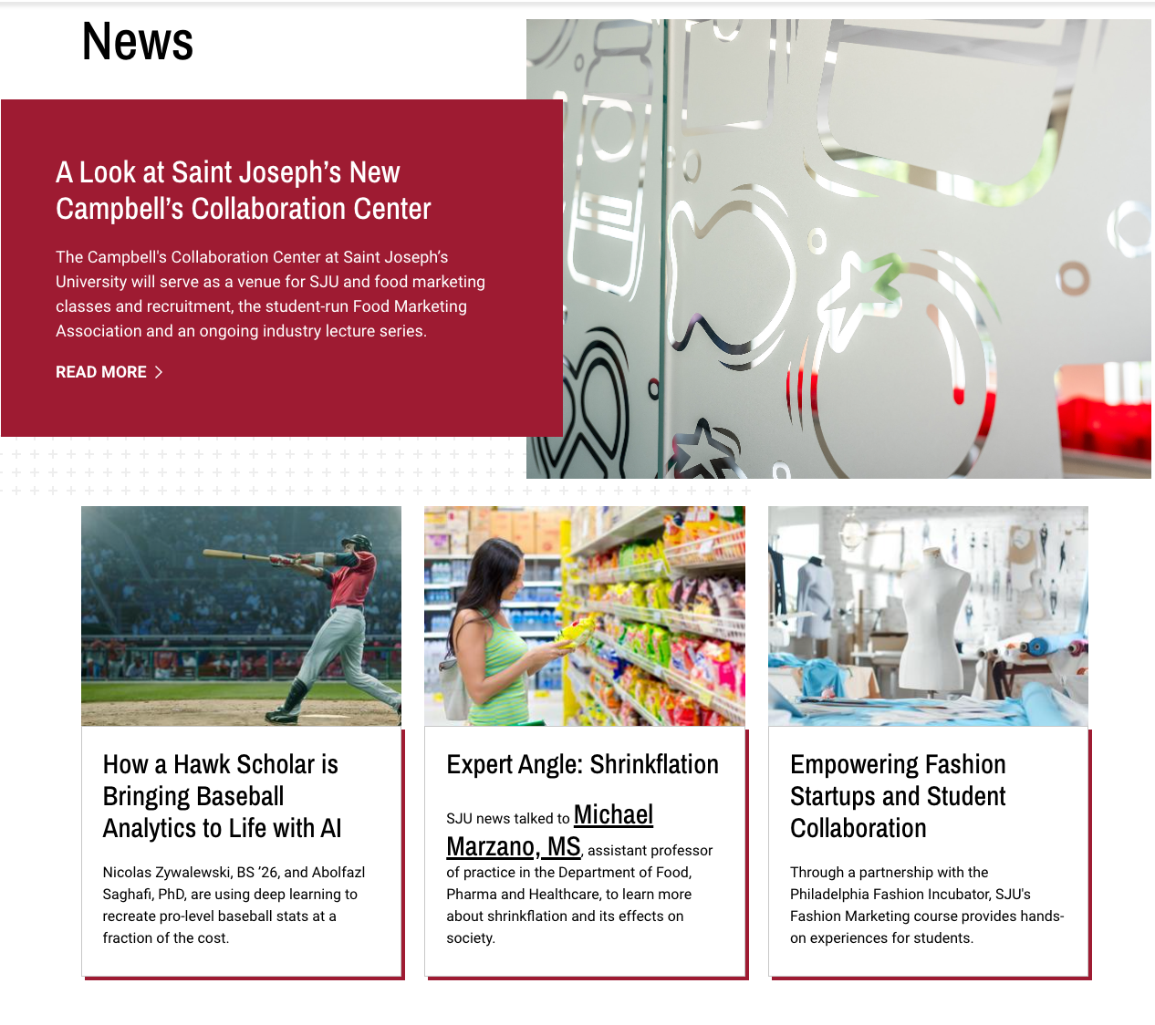
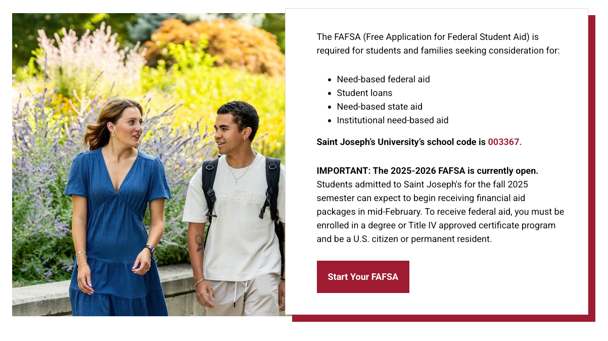
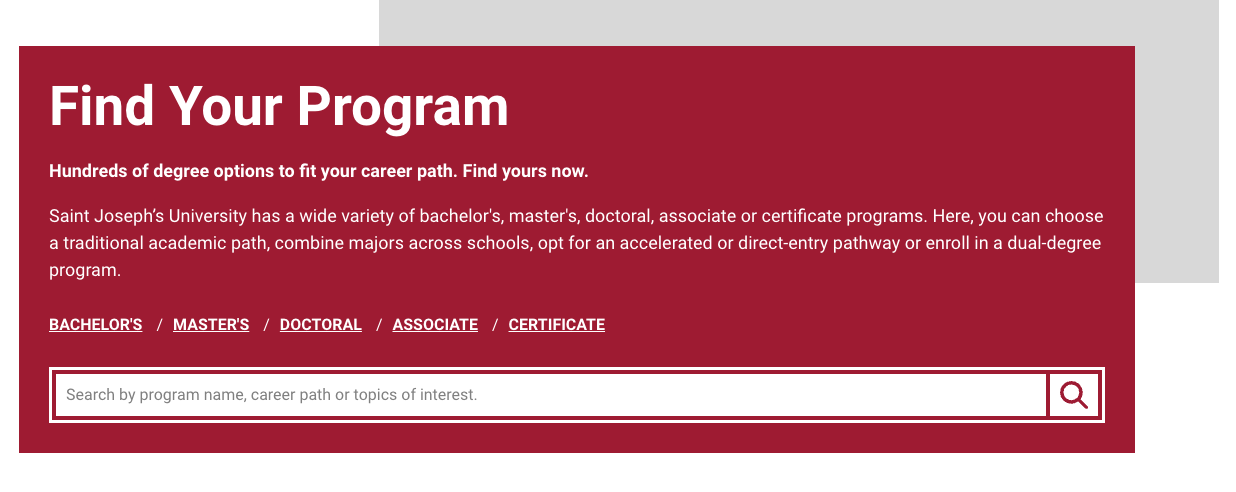
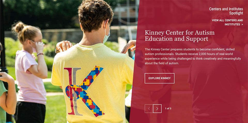
Homepage Hero
Provides a white box containing a heading, subtitle, and button that overlaps an image and is accompanied by background graphics.
 Inputs
Hero Title: Heading
Hero Sub Title: Subheading
URL: URL
Link Text: Link text
Image/Video: Required
Image Dimensions: 3200x1600
Vimeo URL: URL of hosted video file (if using video)
Text Alignment: Choose Right or Left
Style: None, Main or School
https://www.sju.edu/admission/undergraduate
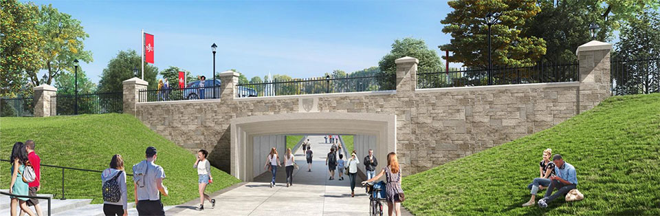
Go Landing Hero
Provides a full-width image to begin a page without a heading or text.
 Inputs
Image: Required
Image Dimensions: 2300x750
https://www.sju.edu/leadership-vision/campus-master-plan/pedestrian-underpass
Mini Site Hero
Provides a full-width image with a white box centered at the bottom containing a heading, content, and an optional button.
 Inputs
Title: Heading
Title Highlight: Portion of the heading you wish to highlight with a different visual style
Description: Content
Image: Required
Image Dimensions: 3200x1600
Optional: Button (created by select text link, then styles, then “red button”)
Landing Page Sub Hero
Provides text against a background directly below navigation elements.
 Inputs
Hero Color: Choose from red, teal, yellow, gray and none
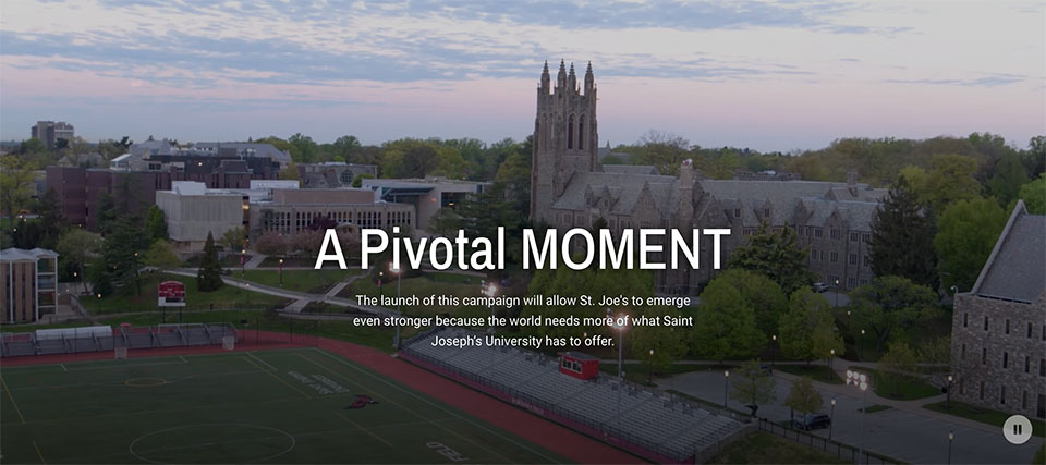
Video Hero
Provides a looping video to kick off the page.
 Inputs
Vimeo URL: This should be a direct link to a Vimeo .mp4 url. The video will be automatically resized to fit the component at a 3:1 ratio.
Content Components
Enhance the appearance of your information by including Content components. These designs give you a way to organize content, pair it with images or links, and make the material stand out.
- Accordions
- Frequently Asked Questions
- Folder Tabbed Accordions
- Chapters
- WYSIWYG (What You See Is What You Get)
- WYSIWYG With Link
- WYSIWYG Block (1280px Max-width)
- Full Width CTA
- 50-50 Split WYSIWYG
- 50-50 Split CTA
- Split CTA Mag Feature
- Side by Side
- Two Across Image + Text
- Directory Listing
- Highlight Feature Box
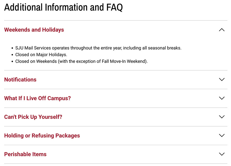
Accordions
Accordions, with their collapse/uncollapse structure, are a convenient way to present a lot of information on a page without overwhelming the visitor, particularly good for lengthy FAQs.
Main Inputs:
Section Title: optional (recommended)
Anchor: [need to investigate]
Accordion Inputs:
Title: Red text that appears when the accordion is closed
Description: Content that appears when the accordion is open
Multiple accordions can be stacked on top of each other and are added via the “Add Accordion” button.
In addition to the standard description WYSIWYG, the following 3 components may also be added to any accordion:
- 50/50 Split CTA: Provides an image on the left and a heading, text and a link button to the right
- Text Block + Link Listing: Provides a section title on one side and a list of links on the other
- WYSIWYG Full Width: Provides standard WYSIWYG extending the full width of the accordion section.
Example: https://www.sju.edu/offices/admin-services/mail-services
Frequently Asked Questions
The FAQ component functions like an accordion with all panels open.
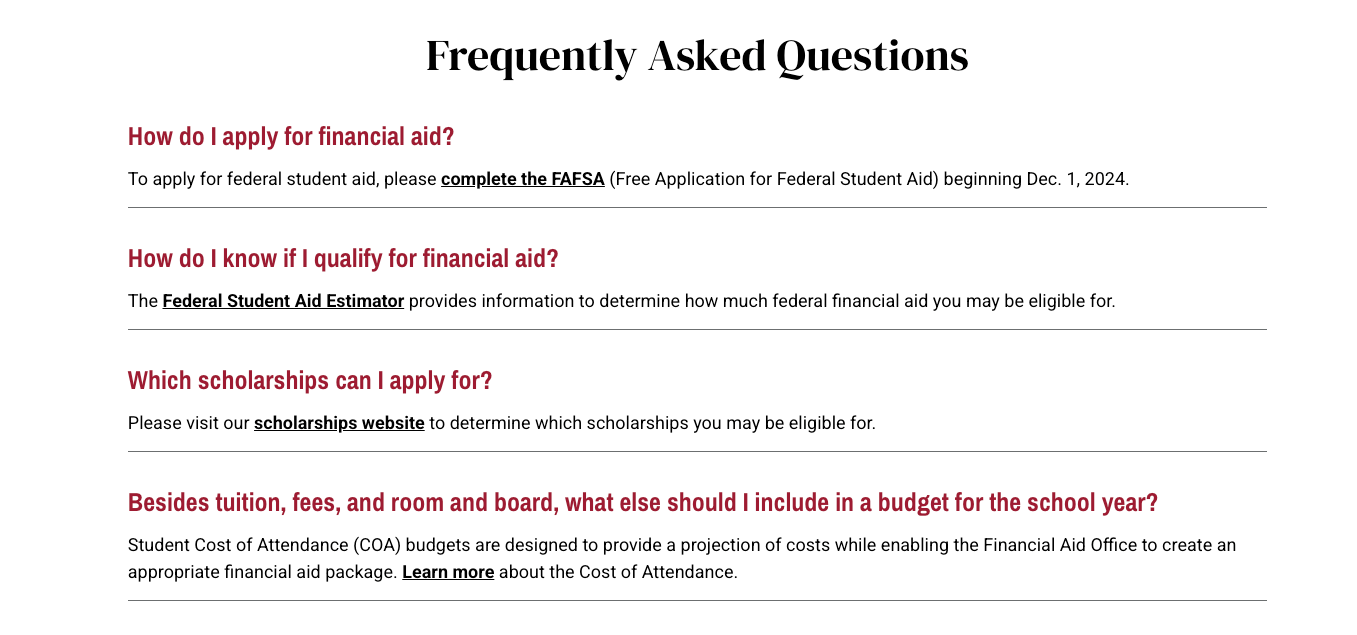
Inputs
Heading Tag: H2, span, none
Heading: Optional intro heading
Option: You can choose to center the heading.
FAQ Item Inputs
Question: Bolded text appearing in red
Answer: Black text appearing underneath the above
Additional questions are added by clicking the “Add FAQ item” button
Options: Can be left-justified or centered
Example: https://www.sju.edu/financial-aid/undergraduate
Slate Accordions
Example: https://www.sju.edu/admission/graduate
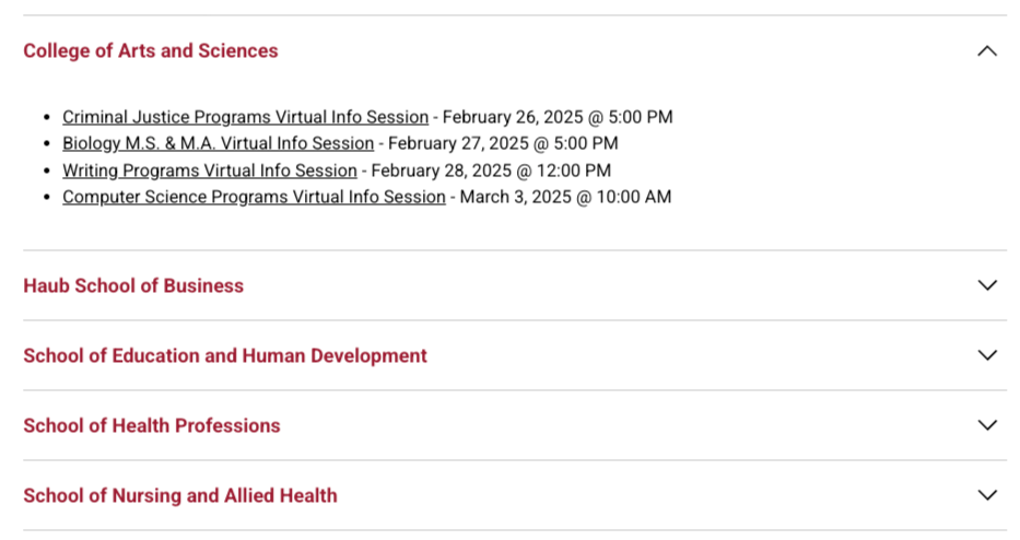
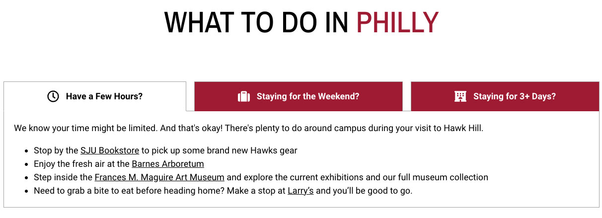
Folder Tab Accordions
Folder tabbed accordions present content in tab-styled sections. Don’t use more than 4-5 tabs.
Intro Section Inputs:
Title: Section heading
Description: Text to appear over tabbed accordions (optional)
Individual Folder Tabs:
Tab icon: Optional icon to appear on the tab
Tab name: Word(s) appearing on the tab
Content: Text content appearing within the tab
Notes:
- Additional tabs are added by hitting the “Add Folder Tab wysiwyg” button
- The checkbox for “Active” lets you designate which tab is to be opened on page-load. The first tab is recommended.
Example: https://www.sju.edu/philly
Chapters
 Example: https://www.sju.edu/resources/brand/working-brand
WYSIWYG (What You See Is What You Get)
Text-editing component capable of headlines and buttons.
Notes
Text may include embedded images, headlines (H2, H3, H4, H5, H6), links, and buttons.
- To add any heading, add then using an H2, H3, H4, H5, H6 from the dropdown.
- H2s should be used to break out major content sections.
- H3s should be used to break out smaller content sections nested within these larger sections.
Buttons may be added by doing the following:
- Set up a text link.
- Highlight it.
- Go into the “Styles” dropdown and select “Red button.” Note: You must select “Full HTML” in the dropdown below the editor.
Example: https://www.sju.edu/academics
WYSIWYG With Link
Same as above, but has URL and Link Text inputs for the link and is left justified.
 Example: https://www.sju.edu/faculty-staff#saint-josephs-university
WYSIWYG Block (1280px Max-width)
Centered WYSIWYG with Title input which is wider that the standard WYSIWYG.

Example: https://www.sju.edu/news/university-report/soar-campaign-hits-200-million
Full Width CTA
Generally used as a centered headline, plus a brief amount of text and a Call-to-Action (CTA) button.
 Inputs
Image: Required
Image Dimensions: 1440x1440
Title: Heading of text area
Topic: Label in red that appears above the title
Description: Content
Link: URL
Link text: Button text
Options: The image can be on the right or left
Example: https://www.sju.edu/athletics
50-50 Split WYSIWYG
Provides 2 columns of individual WYSIWYG text with button(s).
Inputs
Description: Text content you wish to appear.
Link: URL
Link Text: Button text
Options:
- One or more buttons can be added via the “Red button” style.
- You can also select a 60%/40% split if you want to emphasize one section more than the other.
Example: https://www.sju.edu/apply
50-50 Split CTA
Provides a 50/50 split between an image and a WYSIWYG block of content.

Inputs
Image: Required
Image Dimensions: 1440x1440
Title: Heading of text area
Topic: Label in red that appears above the title
Description: Content
Link: URL
Link text: Button text
Example: https://www.sju.edu/alumni
Split CTA Mag Feature
A variation of the 50-50 split where the image does not extend to the side of the screen.

Inputs
Image: Required
Image Dimensions: 3200x1800
Title: Content heading
Topic: Label in red that appears above Title
Description: Content
Link: URL
Link text: Button text
Options
- If link and link text are left blank, then no button will appear
- The topic text can be black, crimson, gold, or teal
- The image can be to the right or left
Example: https://www.sju.edu/leadership-vision
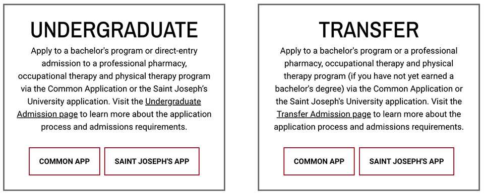
Side By Side (version 1 )
This component provides a 50-50 split that allows a single or multiple cards to appear hanging over the nearest edge of the image, which itself can have an optional shadow.
Inputs
Heading Tag: Choose from none, H2, or span
Heading: Section heading
Shadow Color: The color of drop shadow on the cards; choose from crimson, teal, gray, or none.
Image: Required
Image dimensions: 1440x1440
Big Link Button Shadow (i.e. individual cards) Inputs
- Button Hex Color: The color background of the card is given as a hexadecimal color code
- Heading: Card heading
- Link: URL
- Link Text: Link text
- Blurb: Card content
Options:
- Heading tag: None, H2 or span
- The image can be right or left
- Allows either single or multiple boxes
- No more than 4 recommended
Example: https://www.sju.edu/financial-aid/graduate
Side By Side (version 2 )
This look is achieved by adding multiple Big Link Button Shadow elements.
Example: https://www.sju.edu/financial-aid
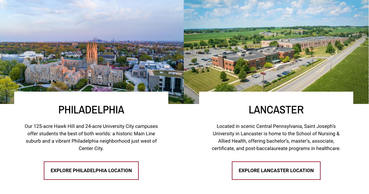
Two Across Image + Text
This component provides 2 cards with landscape-oriented images at the top, followed by a headline, text, and button.
Inputs
Image: Required
Image Dimensions: 3200x1800
Title: Card heading
Description: Card content
Link: URL
Link Text: Button text
Example: https://www.sju.edu/location
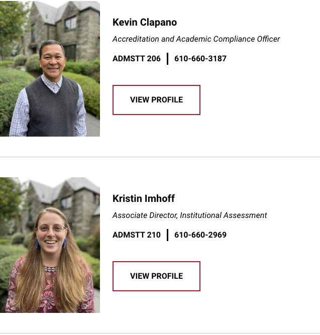
Directory Listing
This component automatically provides formatted headshots, bio information, and links to directory pages for faculty or staff.
Title: Heading of section
Description: WYSIWYG for intro heading (use dropdowns) and any text. Both are optional.
NOTE: Please send a ticket to the web team when using this component:
Submit Ticket >
Please provide the full names of the faculty or staff members you’d like to appear in this section.
Example: https://www.sju.edu/offices/academic-admin/institutional-effectiveness/staff
Highlight Feature Box
This component provides a search box with room for links about the search input area.
Intro Section Inputs:
Title: Main heading of box
Subtitle: Subtitle (optional)
Description: Content beneath the heading
NOTE: Please send a ticket to the web team to use. this component.
Submit Ticket >
Feature Links
Manual Link URL: Type in the title or partial title of the article you wish to link to
Link Text: Link text
To Add links link click “Ad Manual Link Item”
Example: https://www.sju.edu/academics
Linking Components
Help users quickly find what they're looking for or call their attention to one specific webpage with a Linking component. These tools can assist in organizing complicated areas of your website or point your audience towards a next step in their user journey.
- Link List
- Text Block + Link List
- Study Level Buttons
- Give Bar
- Persistent Alert Banner
- Spotlight Split Links
Link List
This component provides a 2-column section for links.
 Section 1 Inputs
Title: Provide a title for the section
Section 2 Inputs
- Provide URL and Link text for each link.
To add a link, click “Add another item”
Example: https://www.sju.edu/prospective-students
Text Block + Link List
 https://www.sju.edu/parents-families
Study Level Buttons
This component provides a full-width colored bar for links to visitors in white text against a colored background.
 Inputs
Title: Title for section
Color: Choose crimson or gray for your background color
Link: URL
Link Text: Link text
Notes
- To make an additional link, click the “Add another item” button.
- Try to have <4 links on your study bar.
Example: https://www.sju.edu/academics
Give Bar
This component provides a very noticeable way to call attention to a link action you’d like the visitor to take.
 Inputs:
Title: Text appearing in bar
URL: URL
Link text: Link text
Color: Choose from crimson, yellow, white, or grey for the bar’s background color.
Example: https://www.sju.edu/admission/undergraduate
Persistent Alert Banner
This component provides a full-width bar to bring the visitor's attention to urgent copy.

Message: Your alert header (optional) followed by whatever your message is.
Example: https://www.sju.edu/offices/student-life/wellbeing
Spotlight Split Links
A 2-column method of calling out links for the visitor that includes a full-width image.

Inputs
Heading: Section heading
Description: Section intro
URL: URL
Link Text: Link text
Hex Color: Hexadecimal code for link color
- #000000 = black
- #FFFFFF = white
Image: Required
Image Dimensions: 320x1600
To add a link, click the “Add Spotlight Link” button.
Example: https://www.sju.edu/
Callout Components
Highlight important facts, figures and faces by using a Callout component. This set of designs can help you emphasize crucial details for your audience and will allow you to provide context around the initiative or program your webpage promotes.
- Column Width Stats
- Stat Card Slider
- Quote and CTA
- Quote Card Testimonial Split
- Three Across Quote Feature
- Testimonial Row
- Three Across Manual Cards
- Three Across Two Mode Cards
- Three Across Cards
- Teaser Blocks
- Button Row CTA Grids
Column Width Stats
A way to highlight stats that will influence your visitors using cards with a crimson or gray background.
 Inputs
Description: Enter the text you want to serve as a heading
Individual Card Inputs
Stat Amount: The large number you want to appear in white
Description: The text that supports the stat
To add a stat block, click the “Ad Stat Block” button
Options: Four cards are recommended., but you can also do only 3.
Note: If you are adding stats, please check with Marcomm first so we can confirm that the stat being represented is accurate.
Stat Card Slider
Another way to highlight stats that get a visitor’s attention. Entering more than 3 stat blocks automatically converts this component into a slider.
Inputs for Stat Card Slide
Figure: The numerical and symbol you wish to use
Stat: Description of what the stat represents
To add additional Stat Card Slides click “Add Stat Card Slides.”
https://www.sju.edu/financial-aid
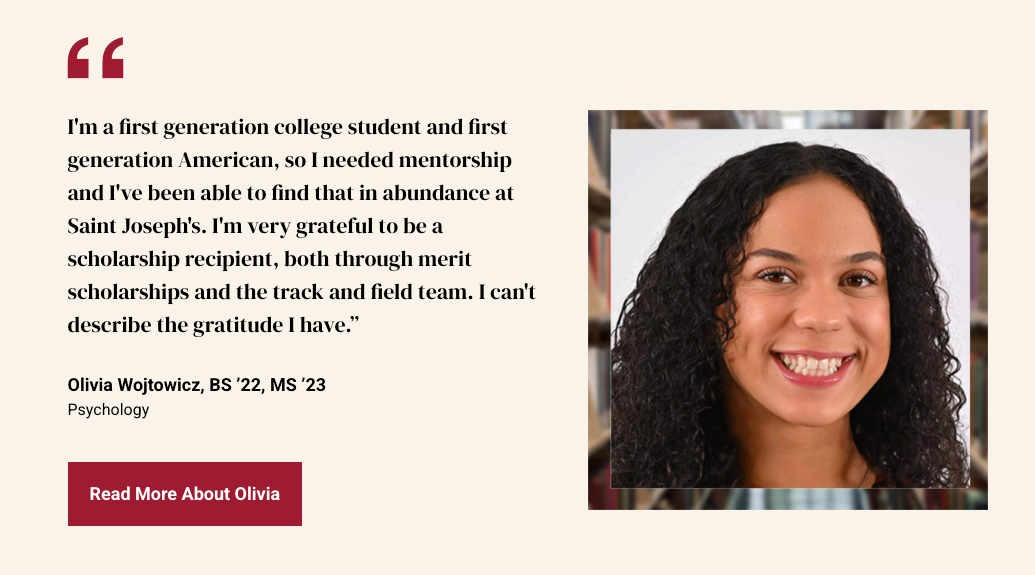
Quote and CTA
This component provides a visually interesting way to break up the page and add credibility to your messaging with a testimonial.
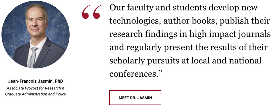 Inputs
Image: Required
Image Dimensions: 1400x1400
Description: The quote
Attribution: That name of the person being quoted
Title: Professional title or student name and year
URL: Typically is a link to a profile post, outcome, or directory listing, but may link to any page you wish.
Link text: Button text
Quote Card Testimonial Split
https://www.sju.edu/offices/student-life/wellbeing
Testimonial Row
An alternate layout for presenting a single testimonial.
Inputs
Image: Required
Image dimensions: 1440x1440
Testimonial Background: For the border on the headshot image. Choose between none, Hall (red and white banner), and TWLWD (library)
Quote: The quote
Attribution: Name of person being quoted
Attribution Title: Professional Title
URL: URL
Link text: Button text
Options: The image can be moved from right to left by checking the “Reverse” box at the top of the component interface.
https://www.sju.edu/financial-aid
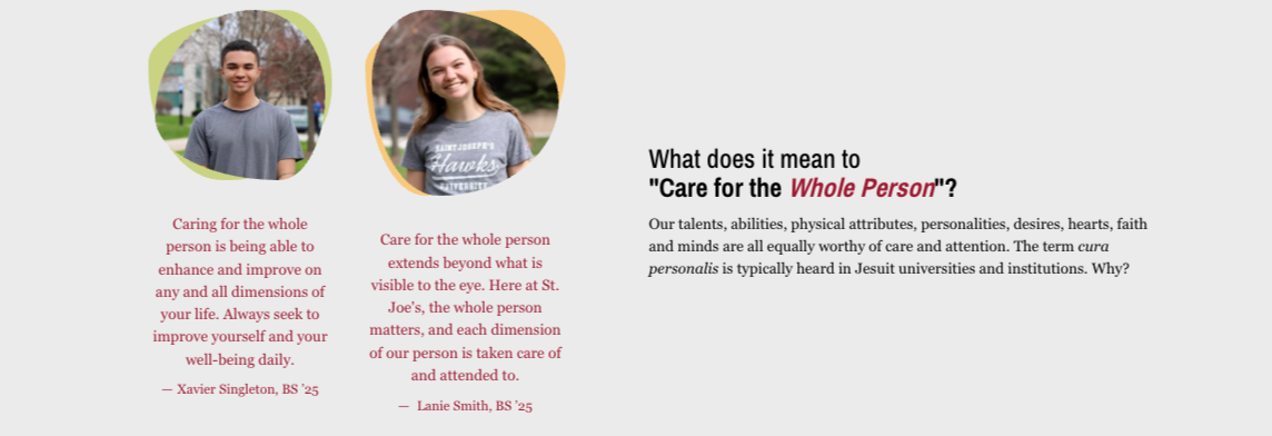
Three Across Quote Feature
This component provides an attention-grabbing way to showcase 3 testimonials.
Inputs
Title: Header for section (optional)
Image: Required - this is the image that appears at the top of the card
Image Dimensions: 1440x1440
Description: Quote
Attribution Image: Required - This is the small image that appears at the bottom of the card
Attribution Image Dimensions: 1440x1440
Attribution: Name of person being quoted
Attribution Title: Professional Title or student year
Three Across Manual Cards
Similar to the Three Across Cards listed above, this component is not reliant on a news feed and images, headings, content, and links can be whatever you wish them to be.
 Main Section Inputs
Title: Section Header
Description: Content under Header (optional)
Manual Cards Inputs
Title: Heading/link text
Description: Content
Link: URL
Image: Required
Image Dimensions: 1440x1440
Three Across Two Mode Cards
This component provides image-based cards on load. Hovering flips them over into a content-based card.

Inputs
Title: Content you’d like to appear on the front of the card at the bottom.
Two-Mode Card Inputs
Title: Reverse card title
Description: Reverse card content
Link: URL
Link Text: Link text
Image: Required
Image Dimensions: 1440x1440
https://www.sju.edu/alumni/connect
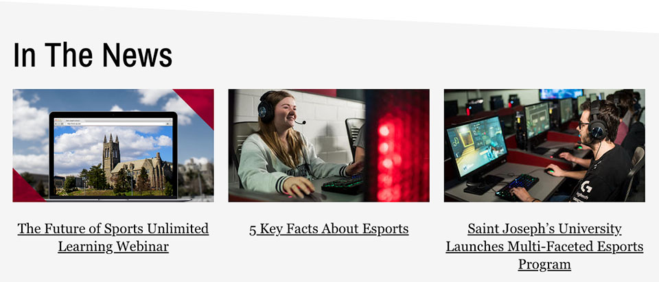
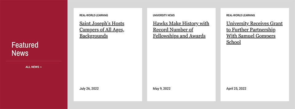
Three Across Cards
This component provides a way to link to three news articles with images, titles, and article summaries.
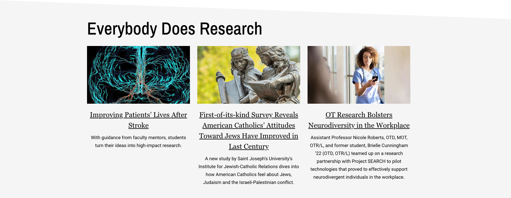
Inputs
Title: Header for section
Description: Content to appear under the header and above cards (optional)
Cards: Enter the title or partial title of the article you wish to have appear. Titles and summaries will automatically appear on the page.
Note: If you have selected an article that doesn’t have a summary associated with it, please send in a Web ticket and we will add one:
https://www.sju.edu/academics/undergraduate
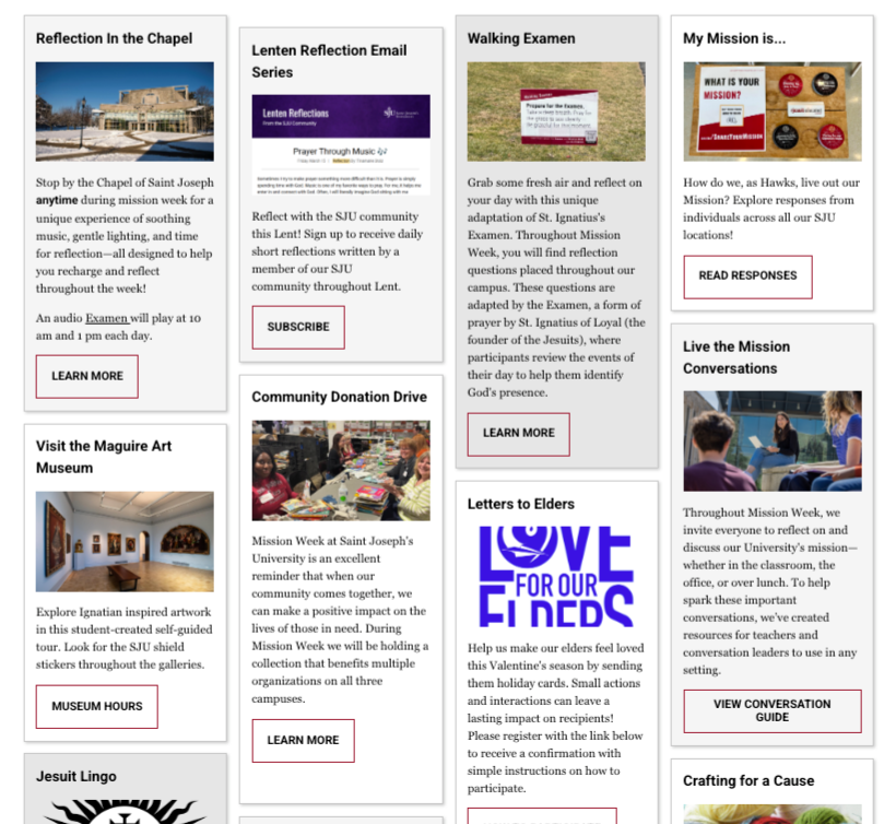
Teaser Blocks
This component provides 4 image-based blocks that contain overlaid content and links. Title Input: Heading for the main section
 Inputs
Title Input: Heading for the main section
Individual Teaser Inputs
Title: Heading for the teaser card
Description: Content for each teaser card
Link: URL
Link text: Link text
Image: Required
Image Dimensions: 1600x800
Optional: You can also do a staggered layout with background graphics
Button Row CTA Grid
This component provides text-based cards that extend horizontally across the page.
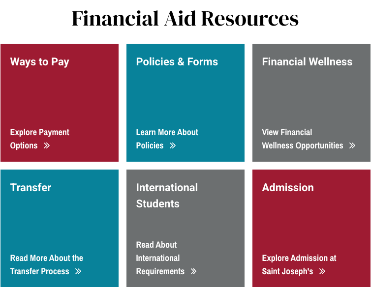
Inputs
Heading tag: H2, span or none
Heading: Heading for the overall section
Subhead Log: Optional subheading under the heading
Grid class: Choose from 2, 3, 4, or 5 columns
Optional: You can choose to center the heading and subheading
Big Link Button Shadow inputs
Button Hex Color: Enter a Hexadecimal color value
Heading: Section heading
URL: URL
Link text: Link text
Blurb: Content
To add a button click “Big Link Shadow Button”
Recommendations:
- Choose 2 or 4 columns when you plan to have 4 buttons.
- Choose 2 columns when you plan to have 6 buttons.
Image Components
Image components give you the ability to showcase photos and other visuals alongside your webpage copy.
Spotlight Carousel
This component provides the opportunity to present a 50-50 page split with an image on one side and a heading, text, and a CTA button on the other, or multiple panels that function like a slideshow.
 Inputs
Title: Section header
URL: URL
Link text: Link text
Color: Red, yellow, teal, or gray.
Slide Inputs
Title: Slide header
Description: Content
URL: URL
Link text: Link text
Image: Required
Image Dimensions: 3200x1800
Split Screen Feature
This component provides the opportunity to present a 60% Image-40% Content page split with an image on one side and a heading, text, and a CTA button on the other against a colored background.

Inputs
Image: Required
Image Dimensions: 3200x1800
URL: URL
Link text: Link text
Alignment: Left or right
Accent Color: Red, yellow, teal, or gray
https://www.sju.edu/school-health-professions
Slide Show
This component provides a classic slideshow with optional captions.
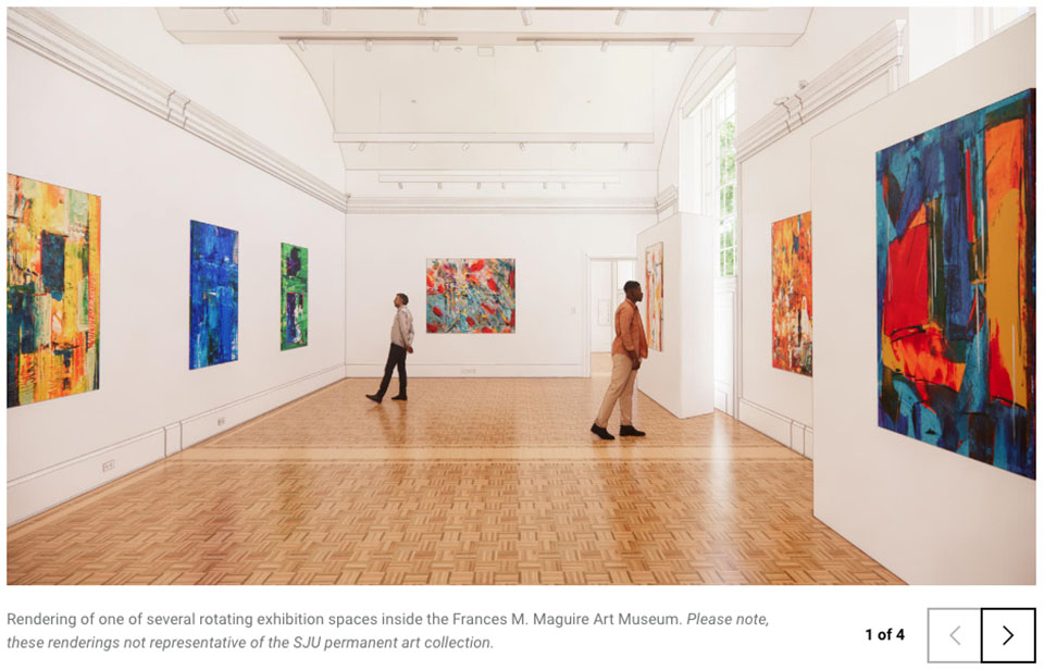
Inputs for Slide Show Slide
Image: Required
Image Dimensions: 3200x1800
Caption: Caption
To add slides, click the “Add Slide Show Slide” button.
https://www.sju.edu/maguire-art-museum
Slide Show Gallery Grid
Full Width Image
This component provides a full-width image with an optional caption.
 Inputs
Image: Required
Image Dimensions: 3200x1800
Caption: Short caption you wish to appear under the image
https://www.sju.edu/faculty-staff
Masonry Grid
This component provides a masonry grid option for cards featuring a header, image, and text.
Inputs for each card
Image: Required
Image Dimensions: 3200x1800
Blurb: Card content
To add additional cards, click the “Add Masonry Card” button.
Recommendation: Do not use this unless you’re creating five or more cards. The more cards you have, the better the visual effect of the masonry will be.
https://www.sju.edu/inauguration/congratulations
News & Event Components
Promote exciting stories or upcoming events using a News & Event component. You can feed a variety of related news stories or calendar listings to your webpage through these designs.
Story / Event Listing

Mini Site News
 https://www.sju.edu/school-education-human-development
Events Listing Component
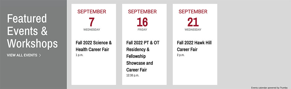 https://www.sju.edu/offices/student-life/careers
Story Listing V2