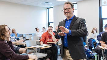
This is a Home Page Hero
This is a Hero Subtitle. It has a 151 character limit. Upload resolution for photos is 3200x1600.
WYSIWYG.
What You See is What You Get.


50-50 Split CTA Title
This is a 50-50 Split CTA with Image Alignment set to "Left".
Text is flexible, but after uploading verify that you left enough space for a small desktop and tablet depending on text, bullets, CTA’s, etc.
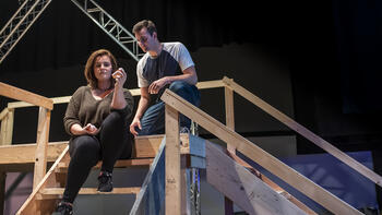
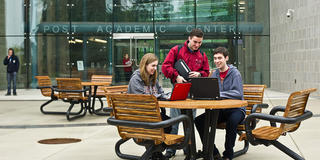
50-50 Split CTA Title
This is a 50-50 Split CTA with Image Alignment set to "Right".
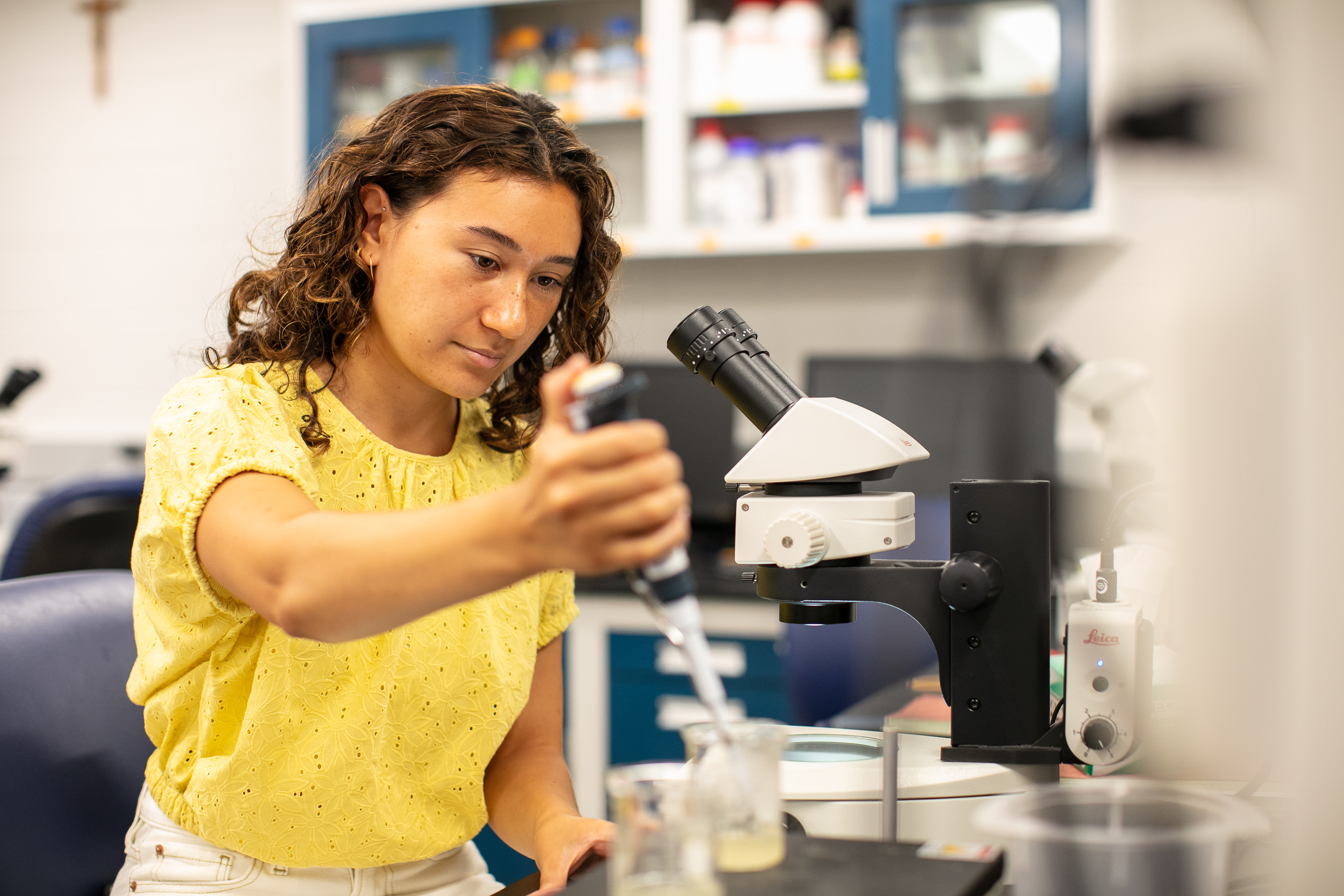
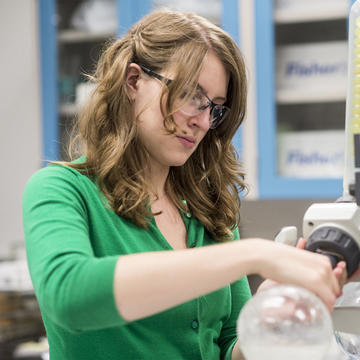
Photo Sizing:
- Upload Resolution: 1440x1440
- Max Display resolution: 720x720
Split Screen Feature Title
Alignment is set to "Left" and Accent Color is set to "Teal". Avoid bullet points and large amounts of text here. Double-check in smaller browsers and on mobile. Photo Upload Resolution is 3200x1800 and Max Display Resolution is 1600x900.
Accordions
-
Description
-
Description
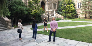
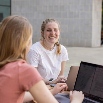
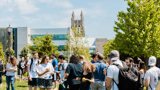
![Saint Joseph's University students walking on campus.]()


This is a Quote and a CTA.
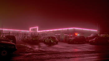
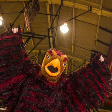
![The hawk mascot flaps its wings under the lights]() Attribution
AttributionTitle


Three Across Quote Feature
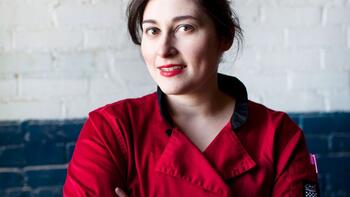
![Seth Kovanic]()
Text is flexible, but after uploading verify that you left enough space for a small desktop and tablet depending on text, bullets, CTA’s, etc.

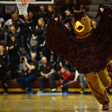
![The hawk mascot flaps its wings]()
Upload Resolution is 1440x1440 and Max Display resolution is 720x720.
![Will Marsh '18]()
You will want to upload a main feature photo as well as an attribution image. Attribution image will be viewable on mobile devices.


Spotlight Links
This is a nice way to provide links to other parts of your site. This section is for any additional text you might want to add.
This is text that appears on the left panel when you mouse over the link on the right.
This is text that appears on the left panel when you mouse over Link #2 on the right.
This is text that appears on the left panel when you mouse over Link #3 on the right.
This is text that appears on the left panel when you mouse over Link #4 on the right.
This is text that appears on the left panel when you mouse over Link #5 on the right.
This is text that appears on the left panel when you mouse over Link #6 on the right.
-
Is this where I add a question?
Yes. This is a layout for an FAQ section where all the questions have a red heading followed by answers.
-
Is it similar to an accordion?
Yes, it is. An accordion requires your visitor to click each heading and then opens a content panel. This helps save space, but does require the visitors to take that click action.
-
What would I use this?
Use this on a page where you have room to spare as far as space goes, and your list of FAQs is not too long that eventually it will look like a big wall of text.
Use this section to describe what it is your tabs will be showcasing. Both this section and the above header are optional.
-
Tab Heading #1
This is the content that appears when Tab Heading #1 is selected.
This is the content that appears when Tab Heading #1 is selected.
-
Tab Heading #2
This is the content that appears when Tab Heading #2 is selected.
This is the content that appears when Tab Heading #2 is selected.
-
Tab Heading #3
This is the content that appears when Tab Heading #3 is selected.
This is the content that appears when Tab Heading #3 is selected.
News

Feature Ttile
-

Name of the person quotedThis is where the quote appears.
-

Name of the person quotedThis is where the quote appears.
This component lets you put your message in this section while allowing two adjacent testimonials to support the claims that you are making and give them credibility via social proof.
Blobby Feature Card Split Links List
Messaging about what you are deciding to feature that will get them to click through.
 Optional Topic

Split CTA Magazine Feature
This is a variation of a side-by-side text and image component where the image doers not extend to the side of the page.


Heading
This provides a nice way to showcase some messaging while providing them links to other pages.
Heading
This provides a nice way to showcase some messaging while providing them links to other pages.
This component, called "Directory Listing API," provides a great way to add a meet the team section to your page.

Director of the Neuroscience Program
Associate Professor of Practice


Quote to go here.
Name of person quoted Title of person quotedThree Across Cards
Descriptive content goes here.